Graphic is good

Have to say I love this new campaign for Jet Blue by US agency Mullen.
Although as a writer I'm not overly keen on headline driven ads.
In this campaign the headlines work because of the visual style.

Just imagine what these ads would look like if the visuals were replaced by photography.
Or even worse...cliched stock photos.
The campaign would end up as nothing more than a bunch of witty wordplay.
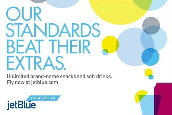
Of course those with an eye for this sort of thing may think that the Jet Blue campaign is strongly reminiscent of W&K London's work for The Guardian.
But who cares.
It's fresh. It's fun. And it's got tonnes of personality.
In fact if I lived in America I'd definitely fly with them.

posted by Stanley Johnson at 3:23 am
![]()
![]()


<< Home